Line-Lines are marks made by a pointed tool: brush, pencil, pen, etc. Lines can vary in width, direction, curvature, length, or color.
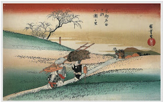
I chose this PAINTING because of the clear lines that reach into places outside of the painting
Is there any question that this photo is extremely plentiful in lines? The lines make the shape, the inside of the shapes, and in black and white with no value, lines are the most noticeable.
Shape-Shapes are formed wherever the ends of a continuous line meet. Geometric shapes such as circles, triangles or squares have perfect, uniform measurements and don't often appear in nature. Organic shapes are associated with things from the natural world, like plants and animals.
I chose this painting because the shape of the objects are very clear and easy to comprehend.

I chose this photo because the shape of the boats makes them seem peaceful and welcoming.
Color-Color wheels show the primary colors, secondary colors, and the tertiary (intermediate) colors. They also show the relationships between complementary colors across from each other, such as blue and orange; and analogous (similar or related) colors next to each other such as yellow, green, and blue. Black and white may be thought of as colors but, in fact, they are not. White light is the presence of all color; black is the absence of reflected light and therefore the absence of color.
All the bright colors make this painting a diverse one.
I chose this photo because it has a lot of various colors, and that's what you want to catch viewers' attention.
Value (Tone)- Value, or tone, refers to dark and light; the value scale refers to black and white with all gradations of gray in between. Value contrasts help us to see and understand a two-dimensional work of art.
The value in this painting gave it depth perception. With less value, the objects would seem farther away or closer.
This is my value photo because the value makes it 3-D. The texture is there, but it would only make lines, since the photo would be 2-D.
Form-Form describes objects that are three-dimensional, having length, width, and height.
I do not understand why the bodies are stretched in this painting, but it sure gives it character
The form of the hills, and fences makes it seem as if they were leaning away from each other, or as if there was an earthquake starting.
Texture-Texture can be rough, bumpy, slick, scratchy, smooth, silky, soft, prickly--the list is endless. Texture refers to the surface quality, both simulated and actual, of artwork.
I chose this painting because it has interesting texture. The texture was put here to make the painting seem "classic" or to make the whole painting equally eye catching.
This picture has a very elegant look to it, VERY elegant. The color, and the lighting make it amazing. but also the pattern of the basket-like container. The texture gives this photo even more elegance.
Space-Space refers to distances or areas around, between, or within components of a piece. Space can be positive (white or light) or negative (black or dark), open or closed,shallow or deep, and two-dimensional or three-dimensional.
The space around the woman in the painting makes her look very close, as if she were actually real.
The space in the background changes the mood from mysterious (from the structures on the ground) to adventurous, I like this painting a lot.
Principles of Design
Balance is the comfortable or pleasing arrangement of things in art. There are three different types of balance: symmetrical, asymmetrical, and radial. The human figure is symmetrically balanced; the same on the left and right side. The tree is asymmetrically balanced; its branches are not distributed equally on each side, but their total weight is balanced left and right. The sun is an example of radial balance; all its rays are equal in length from the center.
This is a good balanced painting because the same amount of people are on each side. everyone acts the same way, making them each seem equal.
This photo is very cool for this subject. Not only is the bird literally balancing, but the photo is balance to, because everything fits in. There's not too many rocks or to much clouds, water or birds. This is a good example of a balanced picture.
Contrast is created by using elements that conflict with one another. Often, contrast is created using complementary colors or extremely light and dark values. Contrast creates interest in a piece and often draws the eye to certain areas. It is used to make a painting look interesting.
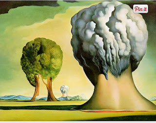
This is an obvious contrast, a peaceful tree to a deadly nuke that look very similar in shape.
This is a good contrast photo because the bow and the rose are completely different. One used to kill, and the other used to court. Cupid and others like this are contrasted.
Emphasis in the focal area of an artwork gives it importance. An artist may stress some elements of the design over others. The eye of the viewer will focus on the area of emphasis or center of interest first, then take in the rest of the composition.
Movement in an artwork means the artist is taking viewers on a trip through the work by means of lines, edges, shapes, and colors often leading to the focal area. Movement is a visual flow through the composition. It can be the suggestion of motion in a design as you move from object to object by way of placement and position. Directional movement can be created with a value pattern. It is with the placement of dark and light areas that you can move your attention through the format.
Patterns are made in art when the same shapes or elements are repeated again and again. Pattern uses the elements of art in planned or random repetitions to enhance surfaces of paintings or sculptures.
Rhythm is the repetition of shapes, lines, and forms. Rhythm is a movement in which some elements recurs regularly. Like a dance, it will have a flow of objects that will seem to be like the beat of music.
Unity means that all elements in an artwork are in harmony. Unity brings together a composition with similar units. For example, if your composition was using wavy lines and organic shapes you would stay with those types of lines and not put in even one geometric shape.
I chose this painting because it emphasizes god giving stuff, not really much else going on.
This is my emphasis photo because it's clearly emphasizing the actual statue of liberty. This works in two ways: Liberty is the highest, and liberty is the most important.
Movement in an artwork means the artist is taking viewers on a trip through the work by means of lines, edges, shapes, and colors often leading to the focal area. Movement is a visual flow through the composition. It can be the suggestion of motion in a design as you move from object to object by way of placement and position. Directional movement can be created with a value pattern. It is with the placement of dark and light areas that you can move your attention through the format.
This is my movement painting because you can imagine what will happen easily. Will someone fall into the water, or will it be a very close call?
This is my movement photo. You can easily anticipate the building falling down. You might even picture people inside the building. Easy to imagine movement here.
Patterns are made in art when the same shapes or elements are repeated again and again. Pattern uses the elements of art in planned or random repetitions to enhance surfaces of paintings or sculptures.
This is a pattern in a photo. It's a pattern, what else is there to say? The cans are in rows and columns of the same structure.
This painting represents a pattern because the same symbols are repeated over and over.
Rhythm is the repetition of shapes, lines, and forms. Rhythm is a movement in which some elements recurs regularly. Like a dance, it will have a flow of objects that will seem to be like the beat of music.
I chose this painting for rhythm because if you turn your head parallel continuously to the painting you can anticipate more orange and purple, straightforward, similar to patterns.
Very similarly to pattern in various cases, rhythms change, but: the rhythms change in an anticipated way. No sudden changes will occur, but they'll never be any perfect symmetry, like this painting.
Unity means that all elements in an artwork are in harmony. Unity brings together a composition with similar units. For example, if your composition was using wavy lines and organic shapes you would stay with those types of lines and not put in even one geometric shape.
Everything is the same except for patterns on the people. The people are acting the sam, they just don't look the same. The structures are pretty much balanced. That's why this painting is my Unity painting
Everything's unified. Nothing's too different, nothings too dull. Graves with green grass. Nice and simple unity.


No comments:
Post a Comment