Thursday, September 26, 2013

Avoiding Mergers 9/11


You never want to do this.  The lower and upper part of the crash is out of the picture.  To get a better idea of what's completely happening, you should zoom out for your audience, whomever it might be.


Framing 9/11

Framing is the act of putting other objects deliberately in front of the main focus.  The point is to give the picture depth.  This photo puts men close to the front, and that makes the viewers imagine us in their places, looking at whatever people, wreckage, and whatever else is happening.


Balance 9/11

Balance is when everything in a photo  looks perfectly normal. Good balanced photos are hard to come by, which is why many photographers go on Safaris.


Balance on dooms day:


Simple enough, it's a flag.  Specifically the U.S. flag.  It's one of the simplest and most balanced, behind    England and several other european nation's flags.  The red and white stripes are following a balanced pattern, and the blue and stars does too.

Lines 9/11

Lines are good to take pictures of to make a photo easy to look at.  They're also good if you want to lead to a main subject.


The lines on the buildings, and the lines the buildings create, combined with the darkness, make for a great depiction of the gloomy day, that was 9/11.

Rule of Thirds 9/11

The rule of thirds is a rule in which an artist/photographer should move things in a photo a third of the distance, to change the viewpoint.

Rule of thirds in 9/11:


If this photo was angled more to the left, and the photographer stood a little to the right, it would've been a good "rule of thirds" because the people would have more walking room.

Simplicity 9/11

Simplicity is the state in which an object in a picture is obviously the main subject and focus of the photographer.

Simplicity in 9/11:


What do you see in this picture?  I see smoke (coming from the building), I see a pole (at the top of the building), I see a hole (in the building).  The building is obviously the subject because of what's happening, simple as simplicity :)

Tuesday, September 24, 2013

Elements of Art and Principles of Design Example


Elements of Art

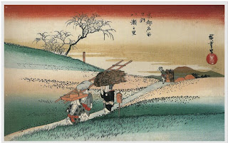
Line-Lines are marks made by a pointed tool: brush, pencil, pen, etc. Lines can vary in width, direction, curvature, length, or color.

I chose this PAINTING because of the clear lines that reach into places outside of the painting

Is there any question that this photo is extremely plentiful in lines? The lines make the shape, the inside of the shapes, and in black and white with no value, lines are the most noticeable.


Shape-Shapes are formed wherever the ends of a continuous line meet. Geometric shapes such as circles, triangles or squares have perfect, uniform measurements and don't often appear in nature. Organic shapes are associated with things from the natural world, like plants and animals.

I chose this painting because the shape of the objects are very clear and easy to comprehend.

I chose this photo because the shape of the boats makes them seem peaceful and welcoming.


Color-Color wheels show the primary colors, secondary colors, and the tertiary (intermediate) colors. They also show the relationships between complementary colors across from each other, such as blue and orange; and analogous (similar or related) colors next to each other such as yellow, green, and blue. Black and white may be thought of as colors but, in fact, they are not. White light is the presence of all color; black is the absence of reflected light and therefore the absence of color.

All the bright colors make this painting a diverse one.

I chose this photo because it has a lot of various colors, and that's what you want to catch viewers' attention.


Value (Tone)- Value, or tone, refers to dark and light; the value scale refers to black and white with all gradations of gray in between. Value contrasts help us to see and understand a two-dimensional work of art.
The value in this painting gave it depth perception.  With less value, the objects would seem farther away or closer.

This is my value photo because the value makes it 3-D.  The texture is there, but it would only make lines, since the photo would be 2-D.


Form-Form describes objects that are three-dimensional, having length, width, and height.

I do not understand why the bodies are stretched in this painting, but it sure gives it character

The form of the hills, and fences makes it seem as if they were leaning away from each other, or as if there was an earthquake starting.


Texture-Texture can be rough, bumpy, slick, scratchy, smooth, silky, soft, prickly--the list is endless. Texture refers to the surface quality, both simulated and actual, of artwork.

I chose this painting because it has interesting texture.  The texture was put here to make the painting seem "classic" or to make the whole painting equally eye catching.


This picture has a very elegant look to it, VERY elegant.  The color, and the lighting make it amazing.  but also the pattern of the basket-like container.  The texture gives this photo even more elegance.


Space-Space refers to distances or areas around, between, or within components of a piece. Space can be positive (white or light) or negative (black or dark), open or closed,shallow or deep, and two-dimensional or three-dimensional.

The space around the woman in the painting makes her look very close, as if she were actually real.

The space in the background changes the mood from mysterious (from the structures on the ground) to adventurous, I like this painting a lot.


Principles of Design


Balance is the comfortable or pleasing arrangement of things in art. There are three different types of balance: symmetrical, asymmetrical, and radial. The human figure is symmetrically balanced; the same on the left and right side. The tree is asymmetrically balanced; its branches are not distributed equally on each side, but their total weight is balanced left and right. The sun is an example of radial balance; all its rays are equal in length from the center.

This is a good balanced painting because the same amount of people are on each side.  everyone acts the same way, making them each seem equal.


This photo is very cool for this subject.  Not only is the bird literally balancing, but the photo is balance to, because everything fits in.  There's not too many rocks or to much clouds, water or birds.  This is a good example of a balanced picture.


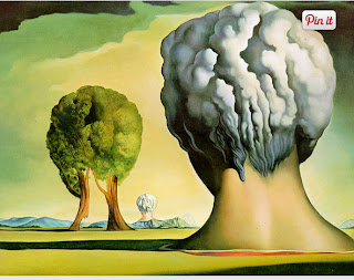
Contrast is created by using elements that conflict with one another. Often, contrast is created using complementary colors or extremely light and dark values. Contrast creates interest in a piece and often draws the eye to certain areas. It is used to make a painting look interesting.

This is an obvious contrast, a peaceful tree to a deadly nuke that look very similar in shape.

This is a good contrast photo because the bow and the rose are completely different.  One used to kill, and the other used to court.  Cupid and others like this are contrasted.


Emphasis in the focal area of an artwork gives it importance. An artist may stress some elements of the design over others. The eye of the viewer will focus on the area of emphasis or center of interest first, then take in the rest of the composition.

I chose this painting because it emphasizes god giving stuff, not really much else going on.


This is my emphasis photo because it's clearly emphasizing the actual statue of liberty.  This works in two ways:  Liberty is the highest, and liberty is the most important.


Movement in an artwork means the artist is taking viewers on a trip through the work by means of lines, edges, shapes, and colors often leading to the focal area. Movement is a visual flow through the composition. It can be the suggestion of motion in a design as you move from object to object by way of placement and position. Directional movement can be created with a value pattern. It is with the placement of dark and light areas that you can move your attention through the format.

This is my movement painting because you can imagine what will happen easily.  Will someone fall into the water, or will it be a very close call?


This is my movement photo.  You can easily anticipate the building falling down.  You might even picture people inside the building.  Easy to imagine movement here.


Patterns are made in art when the same shapes or elements are repeated again and again. Pattern uses the elements of art in planned or random repetitions to enhance surfaces of paintings or sculptures.

This is a pattern in a photo.  It's a pattern, what else is there to say?  The cans are in rows and columns of the same structure.


This painting represents a pattern because the same symbols are repeated over and over.

Rhythm is the repetition of shapes, lines, and forms. Rhythm is a movement in which some elements recurs regularly. Like a dance, it will have a flow of objects that will seem to be like the beat of music.

I chose this painting for rhythm because if you turn your head parallel continuously to the painting you can anticipate more orange and purple, straightforward, similar to patterns.

Very similarly to pattern in various cases, rhythms change, but:  the rhythms change in an anticipated way.  No sudden changes will occur, but they'll never be any perfect symmetry, like this painting.


Unity means that all elements in an artwork are in harmony. Unity brings together a composition with similar units. For example, if your composition was using wavy lines and organic shapes you would stay with those types of lines and not put in even one geometric shape.

Everything is the same except for patterns on the people.  The people are acting the sam, they just don't look the same.  The structures are pretty much balanced.  That's why this painting is my Unity painting

Everything's unified.  Nothing's too different, nothings too dull.  Graves with green grass.  Nice and simple unity.


Wednesday, September 18, 2013

Photo Manipulation and Ethics

The article talks about how some "reliable" photographers take really unreliable photos to lie about what's really happening.  Some examples include the extra missile trick, flares, and explosions, (all part of a little trick called "clone").  Clone is by far the most commonly used simple trick to lie in photos.
This kind of photo taking is extremely unacceptable.


I sure hope it wasn't an American who made this. Unbelievable.  Someone changed a picture just for drama or to make America look bad... oh wait, everyone does that.  Still: not cool.  No explanation needed for why this photo is unethical.


Oh no! the teeth are different! It's the end of the world!  It's dumb, sure, change the teeth for a few hundred bucks, or leave them the same.  Of course, is it really a surprise that they would make people on a magazine titled "we're trusting in god" look good?  oh course it isn't!  Also unlike the original, they show the 2 all professional with douche bag smiles, unlike the original in which they look like normal people.  Time has it right, and thus it is more popular than Newsweek.  This is the most unethical in my opinion because it is just trying to look presentable, not change our views completely. Oh wait one more thing: They made their hair look nicer and they took away the woman's dimples.  Come on man!  Don't persuade the corrupt world forged by us humans!  


Post Shoot Reflection

http://muscle-reaper.blogspot.com/ (for red metal happy)


Very clear photos, excellent use of the half press.
He thought outside the box for his happy photo, way to be clever.
One thing that could've been improved was his red and metal photos.  Try experimenting with different angles.  An exit sign...woo.  For your metal, you should have took a lower angled shot from a diagonal view.

THIS IS CONSTRUCTIVE CRITICISM.


40 greatest photos ever


Kim Ho-Young
So sad, and the worst part: the north korean looks to be the happy one.  Poor poor south korean.  Tear jerking.  The north is run by a communist idiot.

 Aaron Thompson
2 weeks from the end of his service he died.  A little boy looking to grow up with a dad, so sad I can't believe it.  :(____


englishrussia.com

Despite my knowledge that Russia is not so cool with the U.S., this photo is very cool to me, I can only imagine what's going through that Veteran's head right now.  The people he killed, the people trying to blow him up, man... that tank must be like a son/wife to him. 

These photos are just downright the most tear pulling out of the 40.
Only in the 3rd photo do I find the composition meaningful.  There's just something about a slightly angled up photo that compelled me too... :(__
These photos made the cut clearly because the opinion of one person is obviously ALWAYS right, like Barrack Obama's opinions to increase minimum wage.

National Geographic WARM-UP


Wish I could make this photo bigger, looks cooler.  This photo is my favorite mostly for the water and ice.  It just looks so cool in my opinion, clear blue.  Just cool, if it was bigger, i'd be imagining myself swimming in it.
To illustrate the world around me, I could take a picture of 3 groups: one with a democracy, one with communism, and one who's trying to get to democracy from communism.
To submit to the photo contest however, I would take a picture of rain falling into the fog.

Monday, September 16, 2013

Great Black and White Photographers, PART 2

Of Manuel Alverez Bravo, Margaret Bourke-White, and Tina Modotti, I choose Tina Modotti.

Tina Modotti was born in August 17, 1896, Udine, Italy, where she lived with her parents and 5 siblings until her father could not find work in the nearby town of Friuli.  Then, the family moved to Austria, and returned to Udine a few years later when Tina was 9.  
Modotti left school in 3rd grade, and got her first job making dresses with her mother.  When she was twelve, Tina, now with experience, got hired by the Raiser silk factory.
Modotti's father, Giuseppe Modotti was tired of not being able to support the family enough, so he (and his firstborn Mercedes) moved to San Francisco, to get enough money to bring the rest of the family there later.  

Tina left shortly after at the age of 17 to San Francisco, where she quickly found work in a textile factory.  Later, Tina was tired of working just to get by, she wanted to work for fun and participate in some of the culture San Francisco had to offer.  She quit her job in the factory, and supported herself as a dressmaker, and sometimes she contributed to the local amateur theater group.
She met her future husband, Roubaix de l'Abrie Richey, a painter; at an exhibition.
She had a brief theater job.
 Mrs. Modotti perhaps only became a photographer because she met a rich popular photographer, Mr. Weston.  She hung out with him, "helped" him, and posed for him (suck up).
Shortly after, she became a photographer, and was until January 6, 1942, when she died in Mexico City.

Tuesday, September 10, 2013

Camera Parts

aperture-the part of a camera that dilates and contracts to control the diameter of the hole that the light passes though, to let in more or less light. It is controlled by the f-stop ring.
shutter-the part of a camera that opens and closes to control the length of time light strikes the film. There are two types of shutters: a leaf shutter, located between or just behind the lens elements, and a focal plane shutter, located in front of the film plane.
exposure-the amount of light collected by the sensor in your camera during a single picture
depth of field-the quality of the picture.  Lower numbers (bigger lens opening) will bring attention to the subject of the picture and not the background, while high numbers will attract many eyes to the background.
f-stop-the focal length divided by the diameter of the lens.
focal length=distance from the lens to the film

Camera Buttons
5: trigger-takes picture
14: magnification button-you can zoom out by pressing -, in by pressing +.
12: display button-lets you see certain stats
10: setting button-lets you choose certain things such as brightness.
9: menu button-lets you see the menu, and go to settings, or display.

DON'T EXPECT ME TO MEMORIZE THIS PLEASE!

Camera History

1. The "camera obscure" effect is what happens when a hole is cut in a wall in a completely dark room.   If the effect occurs, then light is focused through that hole, and on the opposite wall, the outside is upside down.
2. In the 17th century, Isaac Newton and Christian Huygens invented high quality lenses, an important thing to forward our advancements to modern cameras.
3. The first parts of a camera (invented by Niepce), were glass lens, dark boxes, and FILM.  Film was the thing that actually recorded what images cameras took.
4.  Modern cameras aren't all completely different from Niepce's cameras.  Digital cameras today have light pass through lens, into cameras, to expose film.
5.  Of course, just because they have some similarities with old cameras, it doesn't mean digital cameras don't work on an entirely different level. Digital cameras capture images with an electronic sensor called a CCD. Obviously i'm not an expert on photography so I have no clue what a "CCD" is.  I do know that we use it because it's cheaper, and more efficient.  Not to mention it's much more environmental friendly.
6.  "Auto mode" makes the camera control the flash and exposure, while "program mode" allows you to control flash, exposure, and a few other things.
7.  The "Portrait" mode on a camera blurs out the background to the best of its ability.  This is done by selecting the closest available lens.
8.  The "Sports" mode option is used to get as clear of a photo as possible.  It freezes motion, and uses highest "shutter" speed as possible. I have no clue what "shutter" is.
9.  The "half press"is when you just tap the trigger until it comes awake and aimed at your target.  Think aiming down your sights and preparing to fire.
10. That symbol means the flash is turned off.  It's often a good thing to have on if you want drama in your shots. (camera shots)
11.  That symbol means that the camera will decide if your photo needs a flash or not.
12.If there's too much light when you take a picture, your photo/s will be "washed out."
 13.If there's not enough light, your photo/s will be too dark.
 14. A "stop" is a relative measurement of light.  It can be anything.  One more lightbulb, one less candle, and so on.
15.  I admit I hit the "show answer" button.  I was going to say 2 times for some reason (might be the heavy metal blasting my ears out), but it's one stop more because it's ONE more sun.
16.  4-2=2.  simple as that.  4 suns instead of 2 is 2 stops greater.
17.   longer shuttle speeds=more light
18.   shorter shuttle speeds=less light
19.  The Aperture  of a camera controls the amount of light.
20.  When adjusting the Aperture, you can increase the amount of light by increasing the opening


Friday, September 6, 2013

Wednesday, September 4, 2013

Best and Worst Photos for Greg Eldred 4th period

Best Photo


Worst Photo

I like this class, relaxing and brain using at the same time.  I really liked taking pictures on the 1st 2 days.
As you might imagine, my "best" photo is the one on top and my "worst" photo is the one on the bottom.  It was a close call between 2 pictures for the best photo, and I picked this one despite being blurrier than the other.  I just liked the way it looked, so professional, 2 people giving a talk.
My worst is... well, the worst picture, but it's not necessarily the worst job by me.  It took some skill for me to get a shot like that.  :) like a boss.  Of course, i'm not gonna get rich by selling a picture of a piece of paper being held.  :(  But still, good skill shot. :)